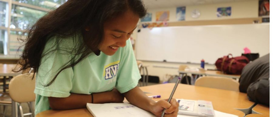
As she circles her black pen along her parchment paper, junior Zasca Ristianto curls her wrist to make a cursive “s”, followed by an “e” and an “n,” until she has written out the word “seniors.”
During her free times in advisory and conference, Ristianto loves to doodle on her planbook. But she does not etch the typical smiley faces and bubble letters, instead she draws calligraphy letters to post on her Instagram account, @lilaclotustypography.
After she discovered the world of typography at the beginning of high school, Ristianto realized that her doodles were genuine art, which could inspire others. In the past year, her interest in typography has risen, resulting from an increased presence of the typography community throughout the Upper School. This spike includes the creation of many Instagram accounts seeking to share typographical ideas.
“I have always been drawing letters since I was little, and I never really thought of it as anything special,” Ristianto said. “But I then started to come across typog- raphy accounts and realized that this was a legitimate thing.”
Sarah Zhou ‘15, who runs her own typography account—@luckyletters—that has over 25,000 followers on Instagram, had the same experience when she first entered the typography world.
“I rst got into to typography last May. I was looking on Instagram and watched some of the ‘most-satisfying’ calligraphy videos,” Zhou said. “This past September, I started bullet journaling [similar to a planner] and that’s when I started posting about it, just because it is such a great community.”
Similarly, although she does not have her own Instagram account, junior Rory Finn has admired calligraphy since 2015 and began to create her own typography, often making cards and gifts for her friends and family.
“At the very beginning, I was just using pencils and would just doodle in my note- book,” Finn said. “It was after Christmas when I got a bunch of calligraphy markers and tools just for making typography specic types of work. After that, I have seen myself starting to devote more time to it.”
Ristianto, Zhou and Finn all credit the community aspect of typography as one of the main reasons that they continue to post and share their ideas.
“I found this whole community out there where they would share their works together and you could collaborate. It was a great community that I had no idea existed,” Finn said. “There are a lot of YouTube videos showing people how to make calligraphy and other design elements that you otherwise wouldn’t know how to do.”
Zhou emphasized the importance of the communal aspect of typography across all di erent platforms, including Facebook, Youtube and Twitter.
“The main motto is ‘community over competition,” Zhou said.
Within the Hockaday typography com- munity, both Ristianto and Finn’s skills have been utilized throughout their junior year, especially since both girls bring their artistic talent to their jobs on Student Council. Ristianto has served on the Form Council since sophomore year and will continue as the Vice President of the Executive Student Council, and Finn will serve as the Form IV President next year.
“I was thinking about making some of the locker signs for next year,” Finn said. “I think my background in typography in previous years will help. As president, having this learned skill will de nitely help me make our senior year great.”
Ristianto has contributed her skills to the community through designing the Class of 2018’s senior logo, which will appear on senior merchandise and posters.
“I had been thinking about the senior design for a while. I wanted something that both looked good and was relatively simple,” Ristianto said. “I was doodling and came up with this design of modern calligraphy with a bit of a shine.”
Former Form III president and 2017-2018 Upper School President Samantha Watson believes that Ristianto’s skills helped create the final design that will, in turn, help shape her senior year.
“I love how Zasca was open to changes, letting our grade suggest adjustments that helped make the nal design something we all contributed to,” Watson said. “I’m so excited that we’ve already picked our logo and I can’t wait to see what’s to come!”
According to Zhou, typography not only allows for free expression that looks pretty, but it also leads to greater organization skills, to which she was rst exposed throughout her time at Hockaday.
“It was fun to decorate my planner. You have to use it everyday, and when you don’t make it personal, it gets boring,” Zhou said. “But it is so useful that I just wanted to do something creative with it and make it more engaging than just writing out lists or the tests that I had.”
While one of the ways that Zhou uses typography is to stay organized, Ristianto and Finn both use it as a way to express themselves artistically.
“I needed a creative outlet, something that I could do in my free time,” Ristianto said. “I do Ceramics as my Fine Art, but I can’t do it in my free time because I don’t own a wheel. Typography is super relaxing and doesn’t require that big of a time commitment.”
Typography is also an art that is fairly easy to pick up and has a universality within it.
“It is really easy to learn and you do not have to have an a nity for calligraphy to succeed in the typography world,” Finn said.
Katie O’Meara – News Editor
